It can be extremely frustrating to see traffic to your website, see the carts, see the products added… and then watch the sales decline at the final, crucial step. Everything looks right, the store is live, the product pages are polished, the traffic is flowing, but something is silently breaking down in the final stretch.
And most of the time, it’s not your product. It’s the experience.
Cart cancellations and abandoned checkouts happen often, and they are signals that something in the buying process isn’t working as smoothly as it should. It could be friction, confusion, distrust, or surprise, but underneath every cancelled order lies the same truth: somewhere between intent and completion, your customer lost confidence.
The Fragile Psychology of Checkout
The checkout stage is the most emotionally charged point of any online purchase. Up to this point, the customer’s journey is spent browsing, discovering, imagining. It’s the exploration phase. But once they decide to buy, the psychology shifts. The customer begins to weigh trust, risk, and reward.
At checkout, even small moments of friction amplify hesitation. A price that changes at the last minute, an unfamiliar payment gateway, a confusing form field, each creates a moment of doubt.
People want to feel secure, informed, and respected. They want to know what’s happening, how much they’re paying, and when they’ll get their product. Anything that challenges that sense of control can lead to hesitation, and hesitation leads to cancellation.
Common Causes And What They Reveal
While every business has its own nuances, there are recurring reasons why customers abandon their carts at the final step.
1. Unexpected Costs
When taxes, delivery fees, or handling costs appear suddenly during checkout, this can catch the customer off guard. Transparency builds trust, and surprises break it. If your customer reaches the payment screen and sees a total that’s higher than they anticipated, this may cause drop-offs.
To fix it, bring clarity forward. Display estimated shipping costs in the cart view. Use a shipping calculator or clearly communicate thresholds for free delivery. The more upfront you are about pricing, the stronger the trust you build, and trust is the invisible currency that drives conversion.
2. Forced Account Creation
No one wants to jump through hoops just to pay. When you force customers to create an account before checking out, you’re prioritising your system over their convenience.
Offering a guest checkout isn’t just a UX improvement; it’s a respect signal. It tells customers that you value their time and autonomy. Later, you can invite them to create an account through follow-up emails or rewards, but don’t hold the sale hostage to a form field.
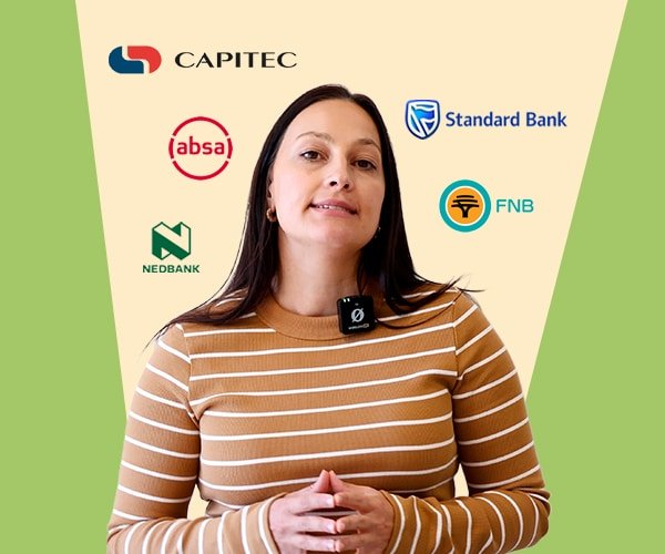
3. Unfamiliar or Distrusted Payment Gateways
At the payment stage, trust becomes tangible. If your payment processor looks unfamiliar, lacks clear branding, or feels “different” from what users expect, it creates anxiety. People are cautious about where they enter their card details and rightly so.
Use recognisable and regionally relevant oayment processors. In South Africa, that means integrating gateways like PayFast, Paystack, or Peach Payments, which customers already know and trust.
4. High Delivery Costs
Delivery fees are one of the biggest triggers of cart abandonment. Customers mentally calculate value before they reach checkout, and when the delivery fee feels disproportionate to the purchase, they question the entire transaction.
If your delivery costs are fixed, explain why. Transparency softens resistance. If you can, offer free shipping above a certain threshold, not as a cost, but as an incentive. Customers are often willing to spend more to reach the free-shipping mark, increasing your average order value while improving satisfaction.
5. Overcomplicated Forms
Every additional field you ask a customer to fill increases friction. Every unnecessary step increases dropout risk. Checkout should feel seamless, like a natural continuation of the buying process, not an interrogation.
Audit your forms. Remove anything that isn’t essential to completing the sale. Use autofill features and clear visual progress indicators.
6. Coupon Code Confusion
Promotions gone wrong can destroy momentum. A customer who enters a coupon code that doesn’t apply, or that wasn’t activated properly, doesn’t just feel inconvenienced, they feel misled. The result is emotional disconnection, not just technical frustration.
If you run promotions, test them thoroughly. Ensure coupon codes are visible, functional, and validated. If a code has expired, communicate it clearly, never let customers feel that your marketing promise doesn’t match the checkout reality.
A smooth checkout experience encompasses no tension, no uncertainty, no effort. The customer glides through the process, trusting each step instinctively. That feeling of effortlessness doesn’t happen by accident; it’s designed through intention.
Study your analytics. Identify where customers drop off, is it at the shipping stage, the payment stage, or the review stage? Use heatmaps or behaviour tracking to see where attention fades or clicks stall. Each data point is a clue, a map to the invisible friction points costing you revenue.
If you need help with you’re online store, email me at vic@webstitchdesign.com