You’ve done the hard work. You’ve attracted a visitor to your site. You’ve convinced them your product or service is worth buying. They’ve added something to their cart. They’ve clicked “checkout.”
Then something happens. They hesitate. They get confused. They second-guess themselves. And they leave.
This happens more often than most business owners realise. The average cart abandonment rate sits around 70%. That means for every ten people who start the checkout process, seven don’t finish it. Some of those are window shoppers who were never serious. But many are genuine customers who wanted to buy, and something got in the way.
That something is usually your checkout page.
The good news is that small changes here can have an outsized impact on your sales. A cleaner layout, fewer distractions, better trust signals, these aren’t major redesigns. But they can be the difference between a completed purchase and an abandoned cart.
Here’s what to include, what to remove, and how each element affects whether someone completes a purchase.
The Goal: Remove Every Reason to Hesitate
Your checkout page has one job, get the customer from “I want this” to “I bought this” with as little friction as possible.
The best checkout pages are seamless. Customers enter their details, confirm their order, and move on. No friction. No hesitation. No second-guessing.
What to Remove: The Clutter That Kills Conversions
Number 1. Too Many Payment Options
I’ve seen websites with four or five different payment gateways at checkout. Paystack, Peach Payments, Ozow, Yoco, all presented as options at the final step.
The thinking is: give people choices. Let them pay however they want.
But too many options create decision fatigue. Your customer gets to checkout, sees five buttons, and hesitates. Which one do I use? What’s the difference? Is one safer than the other?
Most of these gateways do the same thing. Card payments and instant EFT cover what the vast majority of South African customers need.
Keep it simple. Pick one or two payment options that cover what your customers actually use. One gateway can usually handle both cards and EFT. Personally, I like Payfast and Paystack. They’re reliable, they integrate well, and they cover what most customers need.
A simple checkout reinforces trust. A cluttered one creates doubt.
2. Surprise Costs
Nothing kills a sale faster than unexpected fees appearing at the last moment. The customer thought they were paying R500. Now it’s R580 with shipping, handling, and a “service fee” they’ve never heard of.
Be upfront about all costs as early as possible. If you charge for shipping, show it on the product page or in the cart, not at checkout. If there are taxes or fees, include them in your displayed prices or make them clear before the customer reaches the final step.
3. Too Many Form Fields
Every field you ask someone to fill in is friction. Some friction is necessary, you need their name, their email, their payment details, their delivery address. But anything beyond the essentials is slowing them down.
Long forms feel like work. And when something feels like work, people put it off or abandon it entirely. Keep your form fields to the absolute minimum required to process the order and deliver the product.
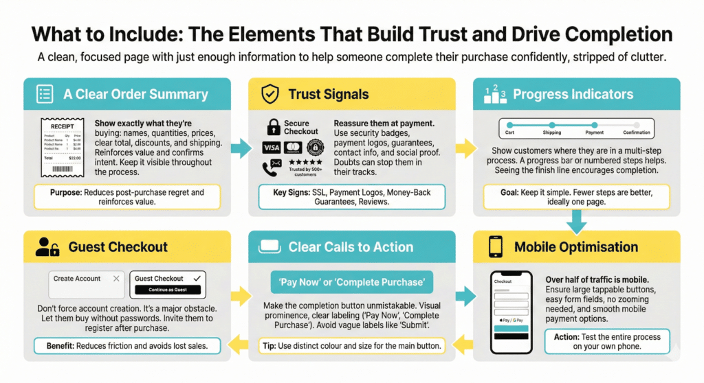
What to Include: The Elements That Build Trust and Drive Completion
Once you’ve stripped away the clutter, what’s left? A clean, focused page with just enough information to help someone complete their purchase confidently.
A Clear Order Summary
The customer should be able to see exactly what they’re buying without any confusion. Product names, quantities, prices, and a clear total. If there’s a discount applied, show it. If shipping is included, say so.
This summary serves two purposes. First, it lets the customer confirm they’re buying what they intended reducing the chance of post-purchase regret or refund requests. Second, it reinforces the value of what they’re getting. They can see it right there, about to be theirs.
Trust Signals
At the moment of payment, trust matters more than ever. The customer is about to hand over their card details or banking information. Any doubt about your legitimacy, your security, or your reliability can stop them in their tracks.
Trust signals reassure them that they’re safe.
These include:
- Security badges
- Payment provider logos
- Money-back guarantees
- Contact information
- Reviews or testimonials
You don’t need all of these. But you need enough to make a stranger feel comfortable entering their payment details.
Progress Indicators
If your checkout has multiple steps, cart, shipping details, payment, confirmation, show customers where they are in the process. A simple progress bar or numbered steps helps them understand how much is left.
Guest Checkout
Forcing someone to create an account before buying is one of the fastest ways to lose a sale.
Yes, you want their email for future marketing. Yes, accounts make repeat purchases easier. But at the moment of checkout, you’re creating an obstacle. You’re asking them to choose a password, verify their email, and commit to a relationship with your brand, when all they wanted was to buy one thing.
Offer guest checkout. Let people buy without creating an account. You can still collect their email as part of the transaction. You can invite them to create an account after they’ve purchased, when the friction doesn’t cost you a sale.
Mobile Optimisation
More than half of e-commerce traffic comes from mobile devices. If your checkout page doesn’t work beautifully on a phone, you’re losing sales.
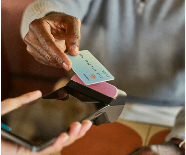
This means large, tappable buttons. Form fields that are easy to fill in on a small screen. A layout that doesn’t require zooming or horizontal scrolling. Payment options that work smoothly on mobile, like Apple Pay or Google Pay, which let customers pay with a fingerprint instead of typing card numbers.
A Quick Checkout Audit
Take a look at your checkout page right now. Ask yourself:
- How many payment options am I showing? Is it simple or overwhelming?
- Are there any surprise costs that appear only at checkout?
- How many form fields am I asking people to complete? Are all of them necessary?
- Can someone buy without creating an account?
- What trust signals am I showing?
- Have I tested this on mobile? Is it easy to complete a purchase on a phone?
If you find friction, remove it. If you find clutter, strip it back. If you find doubt, add reassurance.
Small improvements here translate directly into sales. This isn’t a page to set and forget. It’s worth revisiting regularly, testing changes, and optimising over time.
You don’t need a complete redesign to improve your checkout conversions. Start with the basics and make small changes that encourage visitors to complete their purchase.
Make it easy for them to say yes.
If you need assistance levelling up your website, contact us at vic@webstitchdesign.com